Synopsis of Novel Plot
The novel is about a young man in college who decides that his big mouth [talking] gets him into trouble, at which time he begins communicating entirely by writing. He realizes he is in love with his best friend Xandra, but he can’t bring himself to tell her because he doesn’t want to ruin their friendship.
Reasons I chose These Images, Colors, & Fonts
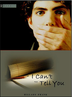
Because the college-age male character communicates entirely by writing, I used an image of a notepad and pencil, as well as a college-age young man with his hand over his mouth. I made the background behind the young man black to show the character’s sense of loneliness and confusion [he feels like he’s in the dark].
The first change that I feel absolutely had to be made to this book cover was putting a real image of a person on it. The original cover seems so impersonal with just a generic, almost abstract image of a young man. The impersonal quality of the original cover does not match the intimacy of the story or the scarily real-life way in which it is told. By using an image of a young man with piercing eyes, the reader will be drawn to the cover and to the novel.
The second most important change that had to be made was the color. The original cover is a yellowish green color, which doesn’t make much ‘rhetorical’ sense. It’s also not very professional looking. I stuck with green, but changed it to a gray-green which is much easier on the eyes and is more subtle so it doesn’t distract from the rest of the content on the cover.
The novel is written for students in tenth grade or above, so I chose a font that is not professional and looks more fun. I also chose the font because it resembles actual handwriting, which ties in nicely with the premise of the book. I included a frowny face [which I edited to appear to lay flat on the notepad] because that image appears multiple times in the novel, and it subtly shows the reader that the character is unhappy with his current life situation.
Alignment
I placed the name of the author in the bottom center because it is the most convenient place on the cover to include the name of the author. Since the image of the young man is largely located in the top right corner, I placed the image of the notepad and pencil to the left to create a sense of balance. I also considered the issue of balance when I put the text slightly out of line, with half of the title below the other half and slightly to the right to emphasize the diagonal angle of the notepad.
Color / Contrast
I chose to put a subtle orange line under the image of the young man to create contrast with the black background. I also chose to use an orange line because the pencil on the cover is orange and it creates a subtle sense of balance. I chose to use black font for the title because the name of the author is in black, and that creates a sense of unity/similarity because the author is the person most responsible for the existence of the book. I placed the name of the publishing company in the top left corner, not just because that’s where it is located on the original cover, but because there is nice contrast with the grayish color of the logo and the black background on which is it located.
Power Zones
On this cover, the power zone is in the top right corner, because that’s where the reader’s eye is immediately drawn. The young man covering his mouth is the most import aspect of the cover [besides the title of the novel] and is therefore nicely positioned in an obvious power zone.
Overall, I hope my new cover is much more enticing than the original and anyone tenth grade and up that saw it would be compelled to read the book.

On your assignment, good work here. The original cover art is quite good from a design perspective, and so you had quite a challenge in front of you coming up with a re/design mock up. A few notes:
ReplyDelete- might not point out how long it took you, which could be read in a variety of ways
- I'm assuming the design on this page is the one you're going for; I saw you working in class on another one, the design on your more recent blog post
- good contrast on this one; seeing the fingers, especially, is important
- good offer MORE contrast on the RAPHIA note; unclear why the G is cut-off
- good thinking of making things dark due to the issues of the novel that you relate
- still confusing why one eye is considerably different than another in the image; seems to me that one should make something of that in the design
- not seeing the blue background you're talking about; comes out darker in this image through your blog methinks
- good clarity of title and author
- I think the pencil on the image really makes a big difference; good thinking about how the pencil impacts what you're going for, and how it points the eyes to the title