"The optimist invents the airplane, and the pessimist invents the parachute." – G.B. Stern

Sunday, May 1, 2011

Rhetoric in Information Design: ENGL 3369 Reflective Memo

Internal Memorandum


        To:           Richard Rice
    From:           Ashlee Jacka
     Date:           May 3, 2011
Subject:           Rhetoric in Information Design

The concept that contributed the most to my overall understanding of document development, design, and production has to be rhetoric, as it pertains to the context in which the document will be used, the audience’s attitudes toward the document, and the persuasive message intended to be achieved by the writer/developer.  In this memo, I will discuss this key concept, and how I will put my knowledge of this concept into practice in my future career.

Rhetoric in Information Design
According to Miles A. Kimball and Anne R. Hawkins in Document Design, rhetoric refers to the way in which the reader feels about the document they are viewing, as well as what the reader believes about the author of the document. The way the reader reacts to the document involves pathos, or emotion, while the beliefs the reader has toward the author involve ethos, or ethical integrity. These are two of the key aspects of rhetoric the author must keep in mind when developing the content and design of information documents to be used in specific settings, because they each play an integral role the document’s ability to influence a given audience.
From the readings and lectures experienced during the course of ENGL 3369, I learned that rhetoric also refers to persuasion. In essence, persuasion is the ability of the author of a document to persuade a specific audience to do something, or to think or feel a specific way about a specific topic. Ethos and pathos come into play the most often. For example, for one of my course projects, I redesigned two separate sheets of information about a nursing home into one complete brochure, adhering to all the elements of document design. By choosing soothing colors and comforting images and placing them amongst essential technical information about the nursing home, the reader is persuaded to feel comforted by the soothing nature of the brochure (pathos), but also feels assured that the information included in the document is correct and that the author of the brochure has their best interests in mind (ethos). Every document includes rhetoric/ is meant to persuade someone to do something, so it is essential to keep the needs and attitudes of the audience in mind throughout the process of design and development.
Rhetoric in the Workforce
In the future, I plan to be employed by an organization involved in Natural Resource Management somehow, and will likely be composing documents dealing with field reports, damage assessments, proposals, recommendation reports, expense reports, etc. These documents will either be created to appease government officials or public and private landowners, and will need to convey to the audience a deep sense of ethos since they deal mostly with funding conservation efforts; however, most Resource Management matters also greatly affect wildlife and people’s lives, and the information documents used to explain those types of personal issues will be more persuasive in nature with the use of pathos.
My dream job would be to work out in the field performing resource analysis and research procedures, such as monitoring wildlife population recovery and documenting the results, as well as monitoring and documenting the health of rangeland and wildlife habitat. My rhetorical objective with composing this or any type of document would be to persuade my audience (government officials or land owners) that my documentation is correct, responsible, and ethical, as well as to persuade them to do something (give my organization money) or feel something (motivation to implement a wildlife or habitat recovery program).
Rhetorical Conclusion
Rhetoric is the concept that added the most to my overall understanding of document design along with its emphasis on the importance of understanding the needs and expectations of a document’s intended audience. To create an effective, persuasive document, the author must first understand the audience, and then tailor the document’s rhetorical method to its specific purpose and rhetorical message. Every document has a rhetorical purpose and is used in a specific context. Recognizing the persuasive message of a document, as well as understanding the intended audience and the circumstances in which they will be viewing the document are the first and most important concepts to employ in the creation and design of any document.  

Wednesday, April 20, 2011

Redesign Project 5 - Nursing Home Brochure


Left side is the Back Cover, Right side is the Front Cover as the brochure would appear when folded in half.

This is how the inside of the brochure would appear when opened. 

I decided to redesign these two pages of information my mom was given while searching in town for a nursing home to put my grandmother in. I knew the information was poorly designed and confusing even before I was in a document design class. For one thing, on one sheet, all the text is centered, one of the classic alignment mistakes that rookie text producers make. Another thing on that information sheet that obviously needed to be fixed was the font and the order in which the different chunks of information were placed. Pretty much everything about these documents sucked, so I thought that making these two separate pieces of poorly compiled information sheets into one well-designed and inviting brochure that could actually clearly convey important information to an audience would be a welcomed challenge to me.
Font
Like I said, the font that was used for the text in the original information sheets is all wrong. For one thing, pretty much every new chunk of information is in a different font - very unprofessional and confusing because there is no real sense of unity to any of the information. I chose Calibre font because it is easy to read, as it a sans serif font, and the letters are nicely spaced. I made most of the text white because it shows up clearly on the blue background of the brochure. For text that is not as important or is an extra bit of information, I made the font a tan color because it still shows up clearly on the blue background, but it doesn’t pop as much as the more important white font.
Color
I chose a violet blue to be the main color of the brochure because it seems soothing and matches the violet blue in the image of the sky I chose to use on the front and back covers. I chose an image of the sky because it also seems soothing, which is something that the likely audience for the brochure will need during the trying time of having to decide what nursing facility in which to place their ailing parent. I also chose an image of the sky because it is reminiscent of Heaven, and the patients who would likely be entering the facility might be close to the end of their lives.
Alignment
Most of the text on one of the original information sheets is centered, so in my brochure design I made sure that the text was left-aligned – much easier to read. I tried to center most of the images because it makes a nice separation between the important text and the images added for emotional benefit. I also bulleted most of the information because it clearly defines which information goes together, and when a new, separate piece of information begins. I tried not to include many images because I didn’t want to bog down the brochure with unnecessary clutter and images of old people and nursing home beds and whatnot.
Wording
I changed some of the wording used to explain what Medicare covers and what it doesn’t because some of the information was simply repeated over and over again in just slightly different ways, which is confusing to the reader who automatically assumes that each block of text should convey different information. I also added information about the Health Care Financing Administration of the U.S. Department of Health and Human Services because the reader, who is likely to be the child of an aging or injured parent entering a nursing home, may want to read up on how and by who that charge was actually agreed upon.
The original information sheets included the number for the Admissions Director of the Heritage Oaks Facility, but I added the actual name of the Director of Admissions for the Heritage Oaks Nursing and Rehabilitation Center in my brochure design because it makes the brochure seem more personal. It would also make it easy for the reader to contact the correct person when they call for information about the facility.

Here's a recap of what the two original information sheets looked like.
             

Wednesday, March 30, 2011

Redesign Project 4 - Resume


For my fourth redesign project, I decided to go ahead and finally tackle redesigning my resume. This task was much more difficult than I had originally anticipated. I found it extremely difficult to spice up my resume for a career in technical communication because the field is technical and I was hesitant to put much ‘spice’ into the redesign. We saw many exiting examples of off the wall resumes in class: some successful, some not so successful, but in the end, I decided to take a much more traditional approach to the resume to demonstrate my ability to produce professional, technical documents to future employers.
I started making changes to my original resume with moving the placement of my name and my contact information. I created two columns for my information, and centered my name above the first column and centered my contact information above the second. I originally had my contact information just below my name left-aligned, but realized that it looked too uneven and there was too much white space at the top right of the page. I think spreading out this information creates more of a sense of balance and cuts down on the unnecessary white space.
Since I am majoring in technical communication, I wanted to create a technical, professional looking document to showcase my ability to create such a document. I used neutral colors, mainly greens, but avoided using plain black and white text to add a sense of variety and excitement to an otherwise standard, bland document. I bolded the information that I felt was more important and/or impressive about myself and my academic achievements so far. I used standard Times New Roman font to make the text easy to read, though I think the color of the text adds a sufficient exotic touch.
My minor is in Natural Resource Management, so when deciding on what neutral colors to use in my resume I decided on natural looking greens and grays. Since I plan on someday working for an organization such as Texas Parks and Wildlife or other natural resource management agencies, I thought using earthy green tones would add a hint of nature, yet because the colors I used are still quite neutral, I am demonstrating that I understand the concepts of practicality in document making. I did use white font in the dark green highlighted portion of the first column so that the text would be clearly visible.
I used two brownish green lines at the top of the page to separate my name and my contact information from the rest of the information in the resume because that indicates that they are distinctly different sections. I also used a thin white line between the two columns of information because it subtly separates the categories of information from the items in each category. I did not use bullets to separate the different items in each category because I felt that it would look unprofessional  and would take up too much space on the page.

Tuesday, March 1, 2011

Redesign Project 3 - Business Card


Here's a reminder of the old card

My redesign done as the project

My ex-stepdad’s business card looked very unprofessional, so I decided that it would be a good idea to help him out by designing a new one for him. The first thing I noticed about the original design of the business card is that the image in the background has no correlation with the subject matter. My ex-stepdad has an eBay business that he runs out of his house. (And when I say he has a business, I mean he goes to garage sales on the weekends and buys cheap things cheaply and then tries to resell those items on eBay for an inflated price. He collects disability checks because he can’t work, and he considers this pastime to be his job/career.)
Anyway, as I began the assignment to redesign this business card, I began looking at VistaPrint.com. As I looked at all the potential business card styles, I noticed that my ex-stepdad had actually used VistaPrint to design his original card. I think when he was designing his business card he just picked the first card style that was listed, and gave no real thought to design elements or the images and icons used. For one thing, the background image on his original card looks like the African Savannah, which has nothing to do with his business or the items he sells on eBay. As I mentioned in a previous blog post, the African Savannah background image would be appropriate if my ex-stepdad was a travel agent, but in his case, the image is in conflict with the context and the message he is trying to send ‘potential customers.’
I chose the card design with an image of an old lamp, picture, and chair because those are all items that could easily be picked up at a garage sale and sold on eBay. The image of antique items is much more appropriate for the kinds of things that my ex-stepdad actually sells than a green landscape. I removed the slogan of the original card, which was ‘Have a great day,’ because it seemed an inappropriate and unnecessary item to include on any business card. I added the slogan, ‘The best little place to find garage sale treasures,’ because it tells the customer what type of merchandise they will find when they visit his eBay store, as well as what kind of place they are buying from.
I centered the name of his eBay store and the slogan because I feel that is the most important information the potential customer needs to decide whether or not they are interested in buying from the cardholder. I bolded the cardholder’s name (Todd Bridwell), because the name of his eBay business is bolded, and it shows correlation between the name of the business and the business owner. I also bolded ‘owner’ because the cardholder is also the owner of the business.  I put a slightly greater space between the physical address and the phone numbers because they are completely different methods of contacting the cardholder. I blocked the phone numbers together and put a slightly greater space between them and the email address, again, because they are completely different methods of contacting him and the space makes the information easier to differentiate.  

Sunday, February 27, 2011

The Simplified Significance of the Gutenberg Press

The Gutenberg printing press enabled the mass production of books and documents in a much more timely way than they could be produced before. It was because of the Gutenberg press that the first mass production of the Bible took place, spreading ‘the word of God’ to the masses. Because of this invention, more people were exposed to the written word and were therefore more educated. As people of every social class were exposed to the written word and education, they were better able to see that their living conditions needed to be changed and that they could change it.
The Gutenberg printing press is indirectly responsible for many history changing events, including the founding of America. The printing press allowed for the mass production of the bible which meant that people who were previously unable to read could read. But since the only book many people had was the bible, religion spread. The Gutenberg press also allowed for the bible to be translated into other languages, allowing almost everyone to read it, spreading the ideas and concepts of the bible all around the world. Gutenberg died without any money or recognition, and it was only after his death that his life’s work and creation was recognized for its potential to revolutionize communication of the written word throughout the world.
The Gutenberg press paved the way for improved methods of printing the written word, such as typewriters, and computers. The publication and distribution of books would not have been possible without the initial invention of this printing press. Without it, people might still be carving messages into rock and only passing down stories through oral communication from one generation to another. Mainly, what the Gutenberg printing press did was to inspire the idea of mass, worldwide written communication, and maybe even communication in general.

Sunday, February 13, 2011

Page Design

In the textbook, Document Design, page design is defined as “the process of placing design objects such as text, headings, and images consistently and effectively on the page, taking into account the actual visual field, the characteristics of the design objects, and the relationships implied among them by the principles of design.”
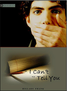
I think a more simple way to say it is to say that page design is “the process of placing design objects on the page in the way that makes the most visual sense and adheres to the principles of design.” For my book cover redesign, the power zone is located at the top right corner of the cover and it is the design object that is the most prominent, important object, and adds the most context to the cover. Placing the image of the young man at the top of the page, the reader/audience experiences him first, relating to sequence. The flow of the page goes from the image at the top of the page, down to the left to the image of the notepad and pencil, and then to the right to the title of the novel. The reader’s eye is then moved down to the name of the author. The sequence/ flow of the document is logical, because the design elements are seen in order of importance as they are supposed to appeal first to ethos.  
It was my intention to make the visual rhetoric of the cover design to firstly appeal to ethos. The image of the young man with powerful eyes and his hand over his mouth provokes curiosity in the reader. I also tried to appeal to logos with the placement of each of the design objects.
I emphasized the connection between the author and title of then novel by making them the same color. I also emphasized the name of the author by placing the name directly in the bottom middle of the design. The angle of the pencil and the notepad works well to point to and emphasize the title of the novel. Also, by placing the title on top of the notepad, the context of the novel (the fact that the novel is about a guy who doesn’t speak and instead communicates just by writing) is more clearly stated/(implied at least). I used an orange line to separate the image of the young man from the bottom of the page because the pencil is orange, and this creates a sense of connection between the young man and the pencil.
I split the page in two, placing the image of the young man in the top half, and the title and the name of the author in the bottom half. I did t his because I thought those pieces of information were of equal importance to the effectiveness of the cover, and should therefore be given equal space. Doing this also creates a nice sense of contrast: the blackish background in the image of the young man with the gray-green color in the background of the title and author text.

Thursday, February 10, 2011

Other Redesigns I Created For Fun [Well, sort of for fun]

Original cover art created by Christoph Neimann, 2004
1st version I created that only took me 12 hours
  

Project 2 - Book Cover Redesign


Synopsis of Novel Plot
The novel is about a young man in college who decides that his big mouth [talking] gets him into trouble, at which time he begins communicating entirely by writing. He realizes he is in love with his best friend Xandra, but he can’t bring himself to tell her because he doesn’t want to ruin their friendship.
Reasons I chose These Images, Colors, & Fonts
Because the college-age male character communicates entirely by writing, I used an image of a notepad and pencil, as well as a college-age young man with his hand over his mouth. I made the background behind the young man black to show the character’s sense of loneliness and confusion [he feels like he’s in the dark].
The first change that I feel absolutely had to be made to this book cover was putting a real image of a person on it. The original cover seems so impersonal with just a generic, almost abstract image of a young man. The impersonal quality of the original cover does not match the intimacy of the story or the scarily real-life way in which it is told. By using an image of a young man with piercing eyes, the reader will be drawn to the cover and to the novel.
The second most important change that had to be made was the color. The original cover is a yellowish green color, which doesn’t make much ‘rhetorical’ sense. It’s also not very professional looking. I stuck with green, but changed it to a gray-green which is much easier on the eyes and is more subtle so it doesn’t distract from the rest of the content on the cover.
The novel is written for students in tenth grade or above, so I chose a font that is not professional and looks more fun. I also chose the font because it resembles actual handwriting, which ties in nicely with the premise of the book. I included a frowny face [which I edited to appear to lay flat on the notepad] because that image appears multiple times in the novel, and it subtly shows the reader that the character is unhappy with his current life situation.
Alignment
I placed the name of the author in the bottom center because it is the most convenient place on the cover to include the name of the author. Since the image of the young man is largely located in the top right corner, I placed the image of the notepad and pencil to the left to create a sense of balance. I also considered the issue of balance when I put the text slightly out of line, with half of the title below the other half and slightly to the right to emphasize the diagonal angle of the notepad.

Color / Contrast
I chose to put a subtle orange line under the image of the young man to create contrast with the black background. I also chose to use an orange line because the pencil on the cover is orange and it creates a subtle sense of balance. I chose to use black font for the title because the name of the author is in black, and that creates a sense of unity/similarity because the author is the person most responsible for the existence of the book. I placed the name of the publishing company in the top left corner, not just because that’s  where it is located on the original cover, but because there is nice contrast with the grayish color of the logo and the black background on which is it located.
Power Zones
On this cover, the power zone is in the top right corner, because that’s where the reader’s eye is immediately drawn. The young man covering his mouth is the most import aspect of the cover [besides the title of the novel] and is therefore nicely positioned in an obvious power zone.
Overall, I hope my new cover is much more enticing than the original and anyone tenth grade and up that saw it would be compelled to read the book.

Monday, February 7, 2011

3 Most Important Information Designs Concepts

The most important concept that I have learned so far is rhetoric, or the ‘context’ of the document and how it must be considered to create a successful end product. The purpose of most documents is to somehow persuade the audience/reader to believe something or take some action. That underlying motive must always be considered, I think, before document production can even begin. I did not realize this fact, but the ‘rhetorical’ aspect of documents has long been an issue for me. For example, my previous redesign project did not come out as well as it could have because I did not consider the ‘rhetorical’ (context) of it. It was not clear which company I was appealing to with the proposal because I had an image and the logo of Meals on Wheels on the cover, when the proposal was actually supposed to appeal to 1st Alarm Co. of Lubbock. I created a document with the wrong ‘rhetorical’ meaning, and therefore the document was ineffective.  
The second most important concept I have gleamed from the readings is the concept of alignment. I never really thought about it before but it makes a lot of sense. One concept within alignment that I find the most interesting is unity. I now understand that where you place something on or in a document is not as important as its inherent connection to other items of equal importance or meaning on the page. Before I just thought alignment was either centered, justified, or right or left-aligned. I never understood the visual importance of just which alignment you choose for a document, or that you can choose more than one alignment for a single document, as long as related information is presented the same way. For example, on a business card, the name of the card-holder should be presented in the same typeface as the name of the company they work for, but does not have to have the same typeface as the card-holder’s phone number, because that is separate information. Even if the information is not placed closely together, the information has definite unity.
The third concept that I find especially important in document design is contrast. Contrast is also a great way in which to show how information items in/on a document are related or unrelated. I have always been somewhat aware of contrast, but not consciously. Until reading the section on contrast in Kimball/Hawkins I never realized there were so many different ways, not even really realizing that bold, italicized, and underlined text are classic (though somewhat cliché) examples of contrast used in documents. I also had never consciously considered that there are so many different ways in which to create contrast. I had previously thought of contrast in text as consisting of two things: color and size; however, there are five notable ways, including shape, size, color, value, and position! Every successful document, either printed or online should include contrast, which is why street signs and websites generally are made up of two or three colors opposite each other on the color wheel.

Thursday, January 27, 2011

Redesign Project 1 - Report Cover

Redesign Project 1 - Final Product

Here is the first project I completed for class. I don’t know yet how to save a word document as an image (so if anyone knows how to do that I would appreciate some help). Because I don’t know how to save a word document as an image for uploading to the blog, I printed out the finished product and then scanned it into the computer and saved it as a jpeg file. In other words, it appears slightly tilted and the colors are not as rich as they appear on the computer screen, but that is only because of the way I had to upload the image to the computer and the blog.
Contrast
I chose to use navy blue for the text and lines at the top and bottom of the page because the color closely resembles the color of the actual Meals on Wheels logo. The navy color I used is more professional looking though. I chose to use beige as the other color, because it is across from blue on the color wheel and the colors make a good contrast. I also used hints of white to mix it up a bit.  
Alignment
I aligned the title of the proposal along with an image of the meal delivery service in action and the names of the people involved in creating the proposal. I did so to draw the audience’s (Meals on Wheels) attention to the fact that the proposal is aimed at Meals on Wheels, and the members of the team who created the proposal are responsible for asking Meals on Wheels to consider the security system. (That makes sense in my head but my wording might be confusing. Luckily I’m not going into a career where I have to explain things…ha, ha.)
I placed a Meals on Wheels logo in the top left-hand corner to place emphasis on the professional side of the organization, and to appeal to the organization (Meals on Wheels). I changed the color of the logo to a more neutral and professional black and white so that the colors would go with the color scheme of the report of blue and beige.
I placed the name of the course, the professor, and date of the proposal at the bottom left-hand corner of the page because I feel that is the least important information and that way the information is aligned with the Meals on Wheels Logo at the top of the page.
Repetition
I only repeated the lines at the top and bottom of the page because I think it gives the page and all its elements a sense of unity. I also think it’s a bit unorthodox to use centered lines along with columns.
Proximity
I placed the image of the meal delivery service in approximately the middle of the page because it offers the most visual and emotional stimulation. Both images used are the same distance from each side of the page.
I still plan to make a lot of revisions to the cover later in the semester after we have gone over all the principles of design in more detail, but I think that overall this cover is much more professional and respectable looking than the one I started with.

Tuesday, January 25, 2011

Design Principles: Report Cover Redesign

For my first project, I will complete the report cover redesign. I might ought to wait to do this project until later in the semester but I'm going to go ahead and give it a shot! I worked on the proposal with peers in ENGL 2311, and I don't feel that the cover is of the same quality as the proposal itself. In other words, the cover is no good. For the redesign I will be using Microsoft Word, but I will steer clear of using a generic word report cover template like me and my group did when we first created the proposal.

I think the image used does not look professional enough, even though it is the official logo of Meals on Wheels, which is the business at which the proposal was directed. I think that one or two images of someone delivering food to the elderly would be much more effective and would add a more professional quality to the document.


Design Principles as They Pertain to the Redesign

Contrast - The first thing I plan to change is the color scheme. For one thing, there are three colors which I now think is too many for a professional document. I don't know yet which colors I will use, but I know I will pick colors that are opposite each other on the color wheel to create contrast. I hate the orange color and the green color, and the orange and green together.

Repetition - This design principle is the least important for this particular assignment, because there is not much that needs to repeated on the cover alone.

Alignment - There are alignment problems all over the place! For one thing, the font should not be centered. The current alignment looks unprofessional, and there is no rhyme or reason for it. Another thing I plan to change is the huge '2010' placed in the top right corner. Currently, the year looks like the most  important piece of information, like it's an important yearly report which it isn't. Also, I am going to change the placement of the title of the report and the Meals on Wheels logo because they are not aligned.

Proximity - I plan to change the placement of the Meals on Wheels logo and the name of the report. It looks unprofessional to place them so close together and in the middle of the page. I will also change the proximity of the text of the members of the team and the course name and number because I now think it looks tacky to have the text double-spaced.

Sunday, January 23, 2011

Overview of 5 Semester Design Projects

Business Card Redesign (Todd’s Shack)
I chose to redesign a business card because I think it will be an important skill for any career, especially one in technical communication. The card I have chosen to redesign was done by my ex-step dad, and it looks extremely unprofessional. The two biggest changes I plan to make to the card are to spread the information out and to make the more important text stand out in some way. The way the information is presently laid out, it looks sloppy and cramped. The information is not easy to see either. Also, the background image has no correlation to the information being provided. The image would be okay if the owner of the business card was a travel agent specializing in African safaris, but he is not. He is attempting to promote his own eBay business which he runs out of his home.


Book Cover Redesign (I Can’t Tell You)
I have chosen to redesign a book cover, because I plan to write a novel of some sort later in my life, and it would be great if I was able to design my own book cover. I have chosen to redesign the cover of my favorite book I Can’t Tell You by Hillary Frank. It is my favorite book, and in my opinion the cover is too plain and does not do the novel justice. The green color seems awkward, and the abstract image of the man on the cover seems impersonal. I plan to find an image more suitable to Hillary Frank’s writing style, and to change the background color of the cover.


Redesign of Resume (My Own)
I have chosen to redesign my own resume because it is in desperate need of an update. Also, being able to design effective resumes will help me considerably in my career in technical communication.


Report Cover Redesign (From Previous Tech Comm Class)
I completed a proposal in Intro to Tech Comm with a group of peers, and the one thing I would change about the proposal is the cover. I plan to first change the colors because I do not think they look good together. I also plan to change the images used and the placement of the text to make it look more professional.

Brochure Creation (Heritage Oaks Nursing & Rehabilitation Center)
This will be my most significant project. When my grandmother had to stay in a nursing home for a short time, my mom gathered quite an assortment of brochures and information from different facilities. The way the information was provided by the Heritage Oaks Nursing and Rehabilitation Center really bothered me, because the handouts seem somewhat unprofessional. The information is just scattered around and is not written well. The information is not presented well either. The font should not be centered, there should be better headings, and there should be a reason for certain information to be emphasized. I plan to coordinate these two one-sheet handouts into a well-written, professional brochure with images.


Sunday, January 16, 2011

Information Design Assignment Ideas

I am a Technical Communication major, and I think one assignment that would help me prepare for a career in tech comm is to design a pamphlet with technical information included in it. I might actually be asked to create one in my future career.

More practical assignments that would help me in my tech comm major would be to design a business card, design a mock home page for a website, and to put instructions for a technical subject into three different types of documents. All these assignments would prepare me for any career in tech comm.

Also, my minor is Natural Resource Management so one assignment that might help me would be to design a professional looking report cover. Such an assignment would help me in my future career, since one area of NRM I would likely go into is writing professional reports and proposals for ranchers or biologists in the field of resource conservation.